
Separation Ename (SE)l is a specially chemically formulated enamel that, when painted on top of a few layers of fused enamel, will change the viscosity of the area to spread and show the layers below. The project in the book is written by Tom Ellis who usually uses this supplement with patterns to very nice effect. Others use it with non-pattern/abstract designs.
 More On Separation Enamel
Tom Ellis has recently given me more information about Separation Enamel...
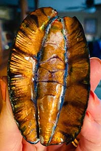
When Separation Enamel is taken into the solution (or dissolved into) the enamel, it not only changes the viscosity of the enamel, but to some degree it changes the surface tension of the glass. What this does with transparents is to concentrate and darken the transparent color in some areas and lighten the color in others. If you apply two parallel lines of Separation Enamel and then fire, the area between the lines will darken and the lines themselves will lighten. This does not show the same way if applying directly on an opaque enamel (2 lines on an opaque doesn't really do anything). See the detail of Tom's bowl below.
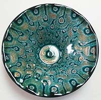
![]() Keep in mind that opaques don't show concentration of color as do transparents - that is, more layers of a transparent will darken the color (one way to shade a transparent) where as more layers of an opaque remain the same. This is one of the physical occurrences of what makes the pattern in Separation Enamel - it is the contrast between dark and light colors. Thus not all color combinations have enough contrast to show a pattern well. Tom recommends using 2110 (Wax Yellow also called Ivory Beige) as a base layer and then 1030 (Foundation White) as a second layer, with a medium to dark transparent as the 3rd layer. The book describes using a light opaque for the 2nd layer, but white will always give you a contrast.
Keep in mind that opaques don't show concentration of color as do transparents - that is, more layers of a transparent will darken the color (one way to shade a transparent) where as more layers of an opaque remain the same. This is one of the physical occurrences of what makes the pattern in Separation Enamel - it is the contrast between dark and light colors. Thus not all color combinations have enough contrast to show a pattern well. Tom recommends using 2110 (Wax Yellow also called Ivory Beige) as a base layer and then 1030 (Foundation White) as a second layer, with a medium to dark transparent as the 3rd layer. The book describes using a light opaque for the 2nd layer, but white will always give you a contrast.
If your experiment doesn't come out as you had wanted, think about this contrast of colors, the thickeness of each layer and the amount of Separation Enamel you have applied. These, along with the firing info below, make a difference in your results.
Firing is also important:
- 1st layer should be hot (remember it's a transparent directly on copper so be sure to fire long enough to get the oxide out of the copper into the solution of the enamel so that no firescale remains under the first layer).
- 2nd layer should be a cool firing to just gloss over
- 3rd firing should also a cool firing to just gloss over
- Separation firing - hot and longer firing
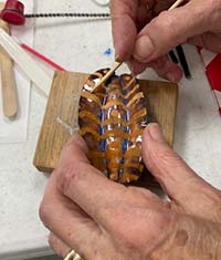
Test SE
Here is a test of various soft/med/hard enamels to see how they affect the SE process. Tom suggests using a 5” square piece of copper. Make sure to make a map of what enamels you used so you remember what you did. Also, to remember the orientation, I suggest you cut a bit off one of the corners, say the upper right corner.
Here goes: you are going to lay down enamels to form a 3x3 grid:
- 1st Layer: Sift 2010, 2030, and 2110 as three horizontal strips on a 5” copper (counter enameled square). You could also use 2009, 2007, 2061, 2020, 2040, 2015, for your first application. Fire to clear (oxide in the copper is taken into the solution of the enamel).
- 2nd Layer: Sift a thin coat of 1010, 1030, and 1045 as three vertical strips (these strips are applied on top of the three horizontal strips you just made) (you could also use 1055, 1060, or any pastel opaque colored enamel – I would not use 1020 as it doesn’t seem to work well. We have problems with cracking at the end). Fire only to gloss – don’t overfire.
- 3rd Layer: Sift a regular amount of 2520, 2747, and 2430 as three horizontal strips (over the layered clears and whites). You can use any medium to dark range transparent color. Pastel colors do not contrast well so do not show a separation pattern. Fire to gloss – do not overfire.
So Far, 3 firings and no over firing:
- Top Row:
- Left hand square is 2010 on copper, 1010 over the 2010 and 2520 over the 1010.
- Middle square is 2010 on copper, 1030 over 2010 and 2520 over 1030.
- Right hand square is 2010 on copper, 1045 over 2010 and 2520 over 1045.
- Middle Row:
- Left hand side is 2030 on copper, 1010 over 2030 and 2747 over 1010.
- Middle square is 2030 on copper, 1030 over 2030 and 2747 over 1030.
- Right hand side is 2030 on copper, 1045 over 2030 and 2747 over 1045.
- Bottom Row:
- Left hand side is 2110 on copper, 1010 on 2210 and 2430 over 1010.
- Middle strip is 2110 on copper, 1030 over 2210 and 2430 over 1030.
- Right hand square is 2110 on copper, 1045 over 2210 and 2430 over 1045.
- This makes 9 different sequences of layers of contrasting enamels to give you information.
- Top Row:
- 4th Layer: The last firing is to apply a SE pattern:
- Suggestion 1: Vertical lines in the left most square, horizontal lines in the middle square and vertical again in the right square. Middle row start with horizontal lines, then vertical then horizontal and so on.
- Suggestion 2: Squares inside of squares inside of squares.
- Suggestion 3: Circles inside of circles inside of circles, etc.
- To get a sense of thickness of application, paint on a line that you think is too thin. Then paint a line you think is too thick. Then paint a line in between the two that is thicker than the first and thinner than the second.
- Note there is more information in Tom’s project in my book (page 244) on applying line spacing, but the above for such a small space as these 3x3 squares is sufficient.
I’d appreciate hearing back from you on what you feel you learned from this test.
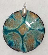
Piece Made from Book Instructions
Here are some pieces made by using the book's instructions. Note the one who took a photo of the piece before firing, a great way to remember what you actually did! These were done in a class with teacher Ingrid Regula, the writer of the Basse Taille project in the book.
By Leslea Hsu |
 |
By Jody Johnson |
By Jody Johnson |